You may think the basic dashboard of Qlik Sense offers you everything you need to analyze data and process information successfully. But several value-adding extensions will enhance your Qlik experience and the user experience on your dashboard.
Check out these eight useful extensions and why adding extensions and connectors are so important.
Why Extensions and Connectors Are Important
Extensions and connectors for Qlik Sense are valuable because they enhance both the user’s experience and the administrator’s abilities. It makes your Qlik dashboard more accessible and user-friendly while giving you the power to do more in a customizable way.
Whether you want to foster a transparent and provocative visual or experience or make your Qlik dashboard more interactive and enticing, extensions are a sure way to up your game.
However, not all extensions truly add value to your Qlik Sense dashboard. To help you sort out the helpful extensions from the unnecessary ones, below are the top eight extensions to enhance your Qlik Sense dashboard for you and your users.
#1. Calendar
This calendar extension is a significant control component for Qlik Sense that allows you to manage and present data fields more user-friendly manner. A nifty calendar extension tool such as this helps with planning and organization, so important dates aren’t missed by anyone involved. 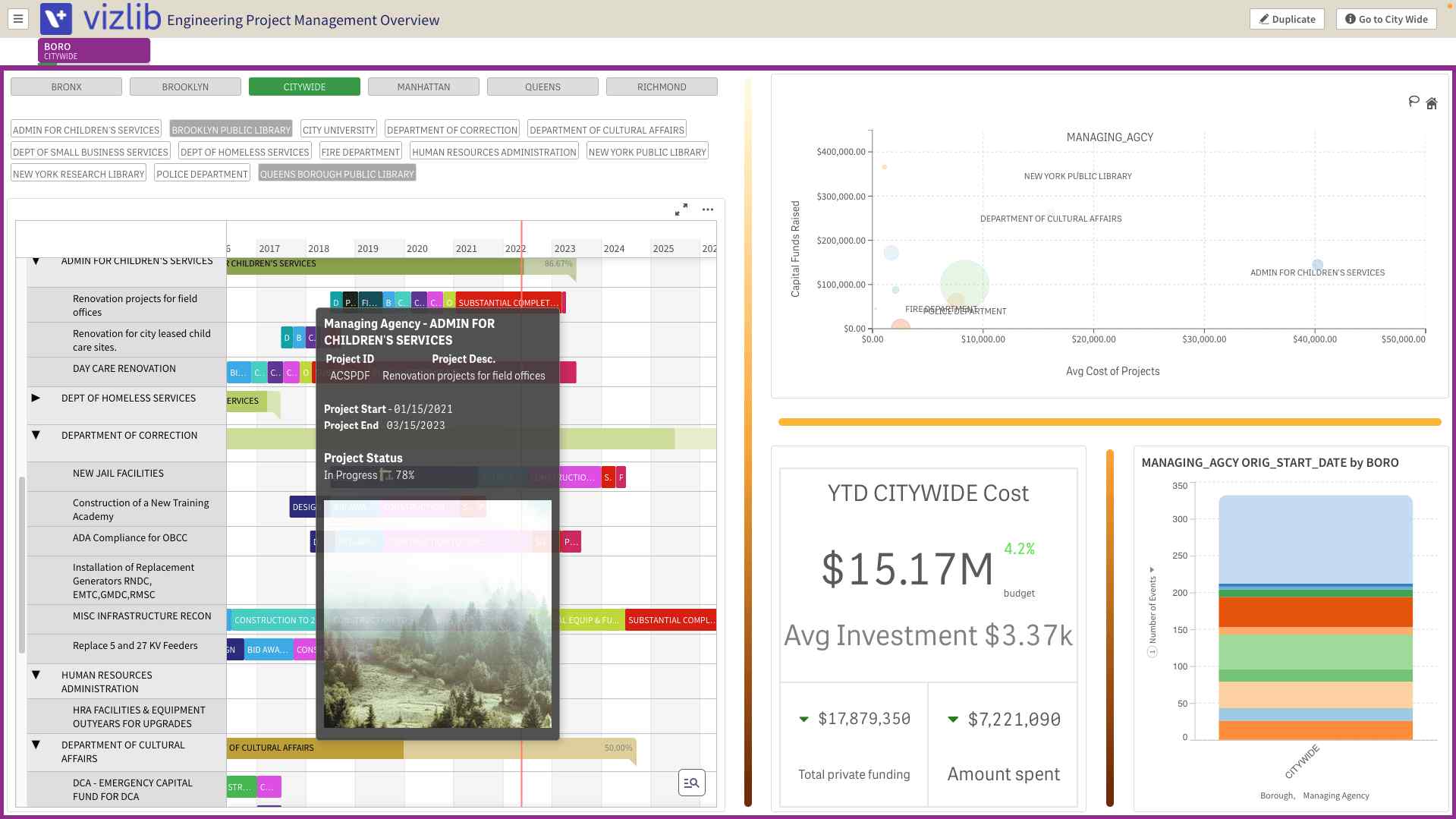
This extension allows you to quickly sort and filter events and deadlines, which can help people in their decision-making process when studying analytics. The calendar extension from Vizlib is handy for executives in the retail, finance, and healthcare industries, who rely heavily on seasonal data to plan.
Features
- Easy-to-use date range selection
- User-friendly customization
- Customizable appearance
- Controlled interactivity
- Time-saving Wizard for fast calendar creation
- Option to use it as a Single Date Picker or Date Range Picker.
- Expanded mode to see the full calendar or collapsed mode
- Qlik Selection state aware
- One-Selected-Value Option
- Pre-defined date selections when opening the app
#2. Waterfall Chart
The Qlik Sense line charts are great tools for displaying analytics. But there are other varieties of charts that add significant value to your Qlik dashboard and user experience. The Waterfall Chart extension from Vizlib adds value to your analytic presentations and understanding of data. 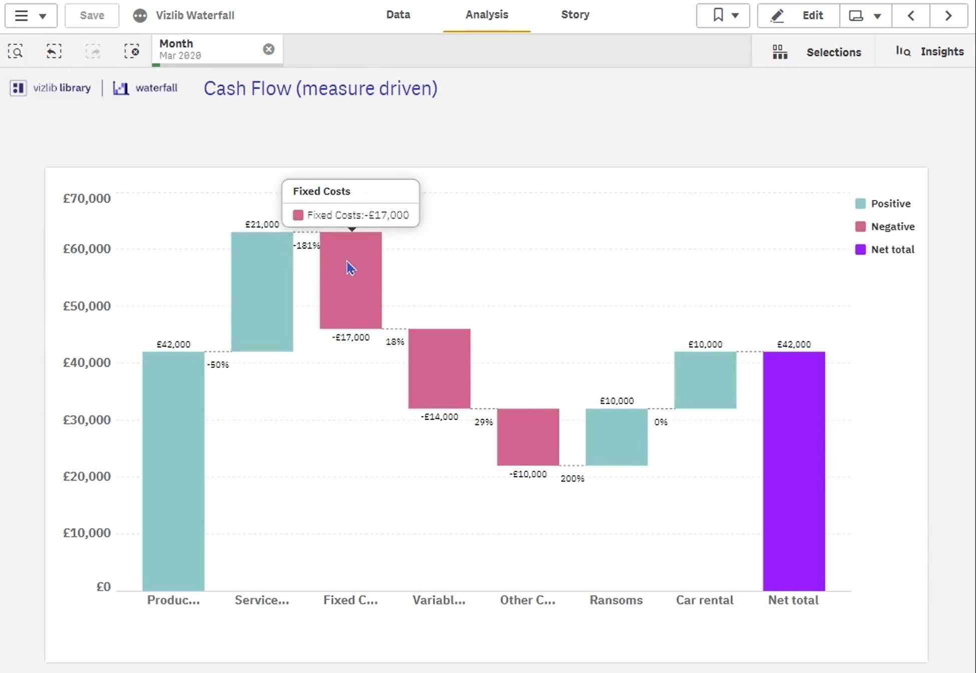
Many humans benefit from visuals representing numbers, giving them a firmer grasp of the information. Accessible charts help drive businesses toward success, and Waterfall Charts are one of the best tools. A waterfall chart helps people understand why a metric changed over time, showing growth or decline. The free-floating steps and blocks in the waterfall chart can help people pinpoint correlations and causations within the data set.
Features
- Revenue and profit flow
- Stock price fluctuations
- Return on investment (ROI)
- Income statements by P&L line, region, or month
- Evaluating enterprise profit
- Project spend by phase
- Variance to budget
- Profits per product
- Contributions to totals chart by region
- Competitor analysis
- Subscriber or customer or growth by month
- Managing stock and inventory
- Root cause analysis
- Inventory over time
#3. KPI Designer
The KPI Designer extension is all about perfecting your dashboard. Every aspect of your Qlik dashboard has value, and you can achieve the dashboard’s full potential with design extensions like this one. The layering concept within this extension is phenomenal for combining charts and showcasing metrics, icons, and overlapping information. This extension allows you to control the X-axis and Y-axis positioning. You can create your visuals or use the pre-loaded templates to help you set up as quickly as possible. 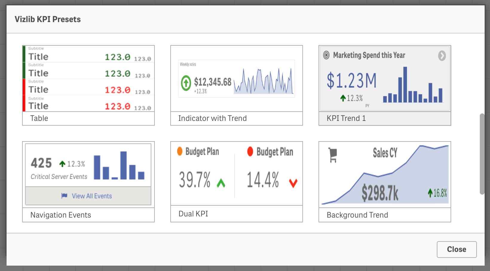
Features
- Craft KPI Objects by using customizable Vizlib KPI Templates
- Several custom layers for your Vizlib KPI Object.
- These layers include Text, Icon, Icon Bar, Image, Line, Master Item, Bar Chart, Line Chart, Bullet Chart, Gauge Chart, and Pie Chart.
- Customization and formatting abilities for all layers
- Ability to customize the style and layout of objects
- User support for improving experience and interactivity
- List of presets to accelerate the Design Process
- Exact accuracy for layer positioning and flexibility
- Interactive conditions to show or hide specific layers
#4. Pivot Table
The tables in Qlik are helpful, but you can get even more out of tables on your dashboard using the Pivot Table extension. The pivot table is super easy to customize to fit your needs and work with other Qlik extensions. It includes dynamic labels, colored indicators, font and size control, and more to help you and your users understand the table quickly and easily. 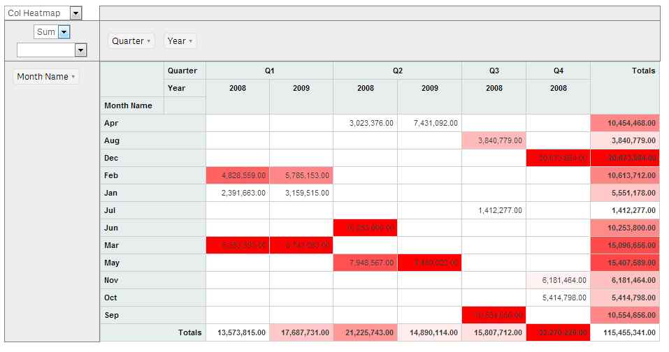
You can choose a range of pivot styles to suit your needs or preferences. While Qlik has its tables, this Pivot Table extension significantly surpasses the standard Qlik tables.
Features
- Conditional options to show or hide specific dimensions and measurements
- Ability to uniquely customize and format your object
- Conditional Formatting to style your Pivot Table
- Indentation or fully expanded pivot styles
- Metrics supplemented with a colored indicator to highlight changes or growth
- Image annotations for metrics
- Export Pivot Table data in a tabular format to XLS.
#5. Sheet Menu Plus
This extension offers all the benefits and capabilities of Vizlib’s Sheet Menu, but Sheet Menu Plus works with Qlik SaaS too! With Sheet Menu Plus, you can design top and side navigation for your menu to offer people a seamless user experience. 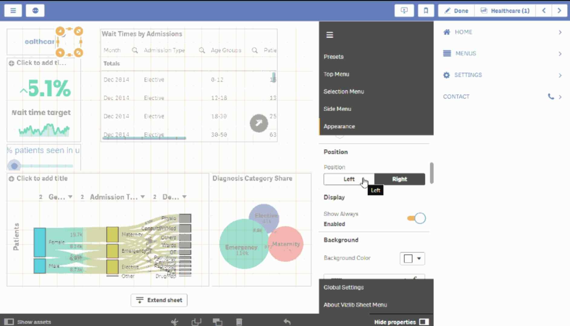
There are loads of customization and formatting options, so you can curate your menu to look however you want and appeal to your users. A transparent navigation element on your Qlik Sense dashboard helps create a strong brand image and engage with users.
Features
- Customized top or side navigation menu
- Rich customization and formatting options
- Support for Vizlib Actions
- Improved interactivity when navigating between sheets
- Show/Hide buttons
- Qlik Sense functionality such as stories, bookmarks, edit menus, navigation, and buttons
- Embedded filters and calendar objects in the side menu
- Dynamic visibility conditions of available sheets
- Cloud extension Compatible with Qlik SaaS
#6. Flow Chart
Another extension that can take your Qlik Sense dashboard to a new level and make the Qlik Sense line charts a thing of the past is the Flow Chart extension. This tool is one of the easiest Qlik extensions to use, so if you’re dipping your toes into extensions and connectors, this is a great one to start with. 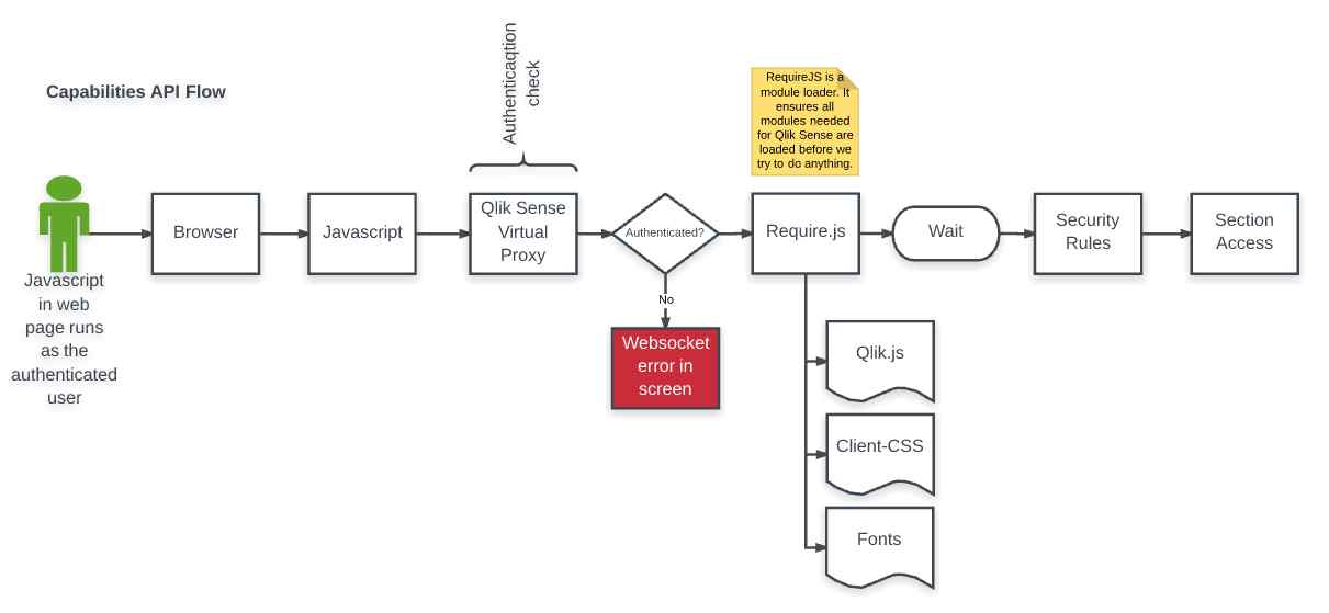
Make visuals and split them into your data to organize information quickly and accurately. Flow charts support one form of measurement with multiple dimensions for viewing. So the width of every link represents a metric volume between dimensions. A flow chart is similar to a Sankey chart, but a flow chart displays the results more understandably.
Features
- Fully customizable chart with several formatting options
- Smooth transitions between selection states
- Modes of interactivity: Zooming, Vertical dragging, rearranging, and sorting of dimensions
- Color choices based on node type, dimension, and measurements
- Support for alternative dimensions and measures
- Support for full-interactivity
- Ability to make the chart read-only
- Support for alternate states
- Conditional show and hide of dimensions
- Clear and definable visuals
#7. Dashboard Filter
As discussed, charts are an incredible tool for understanding and presenting data and information to help people make difficult but necessary decisions. When analyzing data, filtering through charts and highlighting what needs to be addressed can be challenging, but this dashboard Filter extension enables you to sort better and hide what you don’t need to look at. 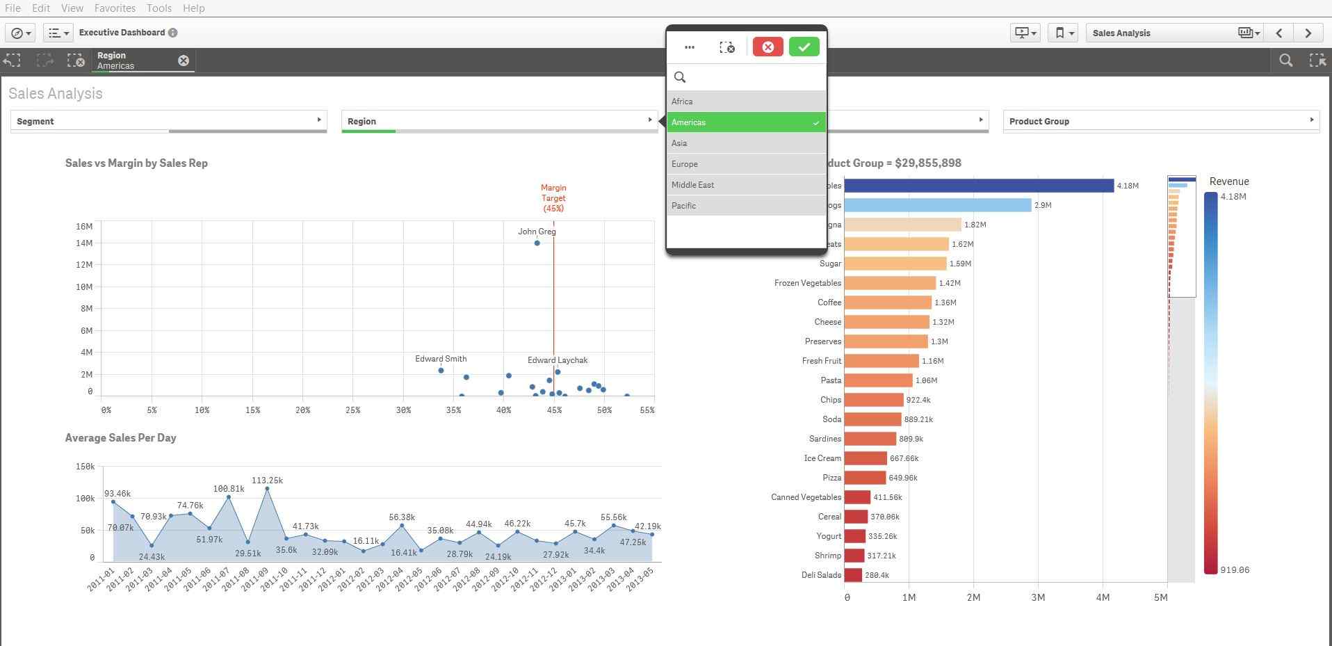
The filter extension also extends to other aspects of your Qlik dashboard, filtering based on impressions and engagement. You also have the power to filter the date field, so this works well with the calendar extensions discussed above.
Features
- Three different component types: Listbox, Dropdown, and Buttongroup
- One selected value option
- Default selections
- Support of all Qlik filtering possibilities
- Locking fields
- Selecting exclusions and alternative s
- Qlik Selection state aware
- Export Field values to XLS
- Copy cell value on right-click
- Powerful and user-friendly search functionality
- 100% use of the Qlik Engine API
- Conditional show and hide of filter values
- Filter styles for brand imaging
- Responsive mode and dynamic screen resolutions
#8. Story Timeline
Data and numbers can be challenging to convey to other people, especially in a short presentation or conversation. Charts and graphs are beneficial but can still lose significance when presented all at once. Storytelling is the best way to communicate with others and get your point across. 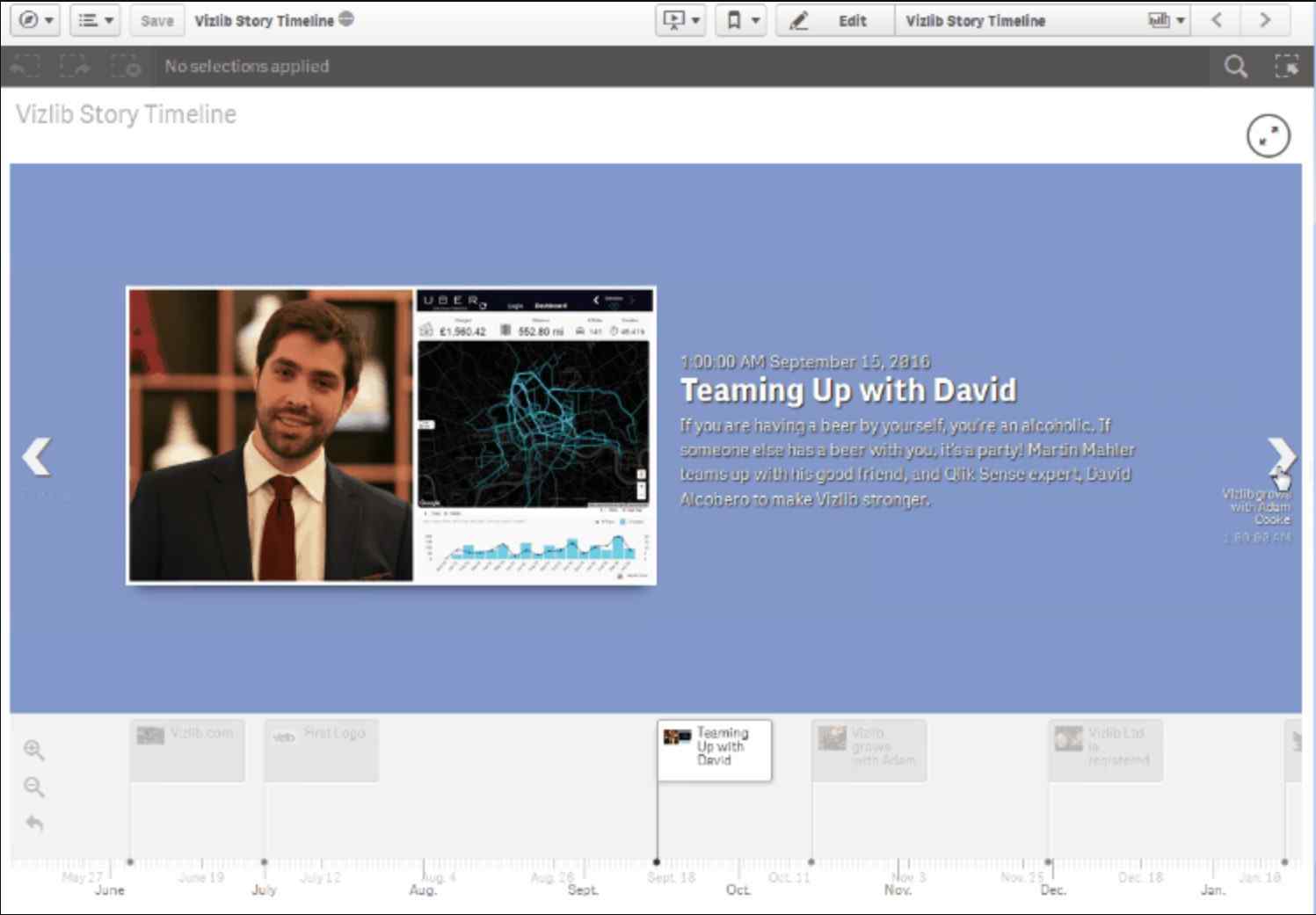
Stories are easy for humans to understand, digest, and remember. And once you understand the story told by the data, it becomes easier to make the tough decisions about a business. Using this Story Timelines extension from Vizlib, you can curate visual narratives that help straightforwardly formulate complex data and analytics.
Features
- Create visual, media-rich timelines
- Presents clear milestones
- Power of the associative Qlik Sense in-memory engine
- User ability to travel through the story
- Overview of project stages
- View interactions between employees and customers
- Monitor events on a visual timeline
Final Thoughts
While the primary applications of Qlik Sense are impressive, there is much more potential to unlock. Using extensions and connectors can bring your
Qlik dashboard to a new level, enhancing your abilities to create visuals for data and understand analytics.
Qlik Sense is about making complex datasets accessible and digestible, and these value-adding extensions make it easier to achieve your goals.


